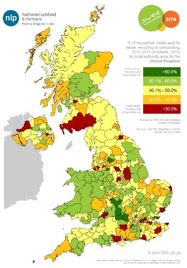
Showing the worst-performing councils in red and best performers in dark green, the map brings together a range of publicly-accessible data from 2012/13 from Defra, WasteDataFlow, SEPA, WRAP, the Office for National Statistics and Resource Magazine.

The online digital tool allows users to click on individual local authorities to view information about recycling services, materials collected, waste arising per capita and collection frequency for each authority.
It also contains the post-2009 rural/urban classification of local authorities for England compiled by the Office for National Statistics (ONS), to show the performance differences between urban and rural authorities
Although the map is currently based on 2012/13 data, recycling rates will be updated on the tool once Defra and the Scottish Environment Protection Agency (SEPA) officially report the figures for 2013/14 later this year.
Produced by consultancy Nathaniel Lichfield & Partners (NLP) on behalf of waste management firm SITA UK, the interactive map comes in response to recommendations made in the Keep Britain Tidy report earlier this month – ‘The Ur(bin) Issue’.
Also commissioned by SITA, the report had called for more readily accessible information about local authorities’ recycling performance (see letsrecycle.com story).
Political statement
SITA said it hopes the map will provide residents with an ‘easy-to-use’ interactive tool that will encourage them to recycle more, but that the colour-banding “is not intended to make a political statement”.
[testimonial id = “38” align=”right”]
Basing the average national recycling rate in the middle of the scale, local authorities falling below 30% have been coloured red, those between 30-40% coloured amber, 40-50% yellow, 50-60% green and those achieving 60%+ have been coloured dark green.
David Palmer-Jones, chief executive of SITA UK, said: “There is a good deal of publically available data for recycling and waste services at a local authority level, but we wanted to collate this information and present it in an easy-to-understand graphical format that everyone could use – not just those with enough interest to trawl through spreadsheets.
“If we are going to improve recycling rates, our industry needs to engage the householders that play such a vital role in the process and providing quality, accessible information is the first step in that process.
“The colour banding will inevitably cause some debate, and we value feedback on it so that we may consider refining future versions, but we felt that a bold, simple, banding would help to engage a wide audience – it is not intended to make a political statement.”
Director at WRAP, Marcus Gover, said: “Recycling has increased significantly over the last ten years, however a lot of items that can be recycled are still going to landfill. We know that people want to recycle, but there is confusion around the issue.”


Subscribe for free